Serious Education, Playful UX.
IHNA Website revamp
Case study
Goal
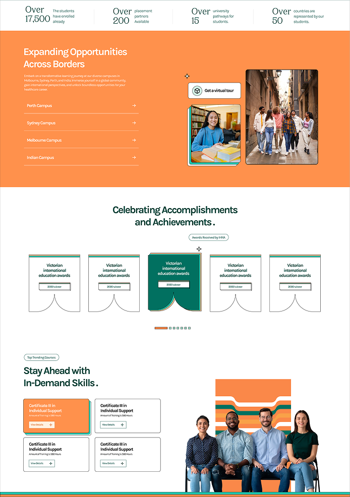
The Institute of Health & Nursing Australia (IHNA) website needed more than a facelift, it required a fundamental shift. Metaveo's goal was clear: transform a cluttered, aging site into a future-ready digital campus. We envisioned a platform that would streamline the user journey, reflect a modern “education for the future” ethos, and support IHNA’s 30,000+ global students. In short, turn confusion into clarity and make finding information effortless.
UX & Navigation Gaps in the Old Site
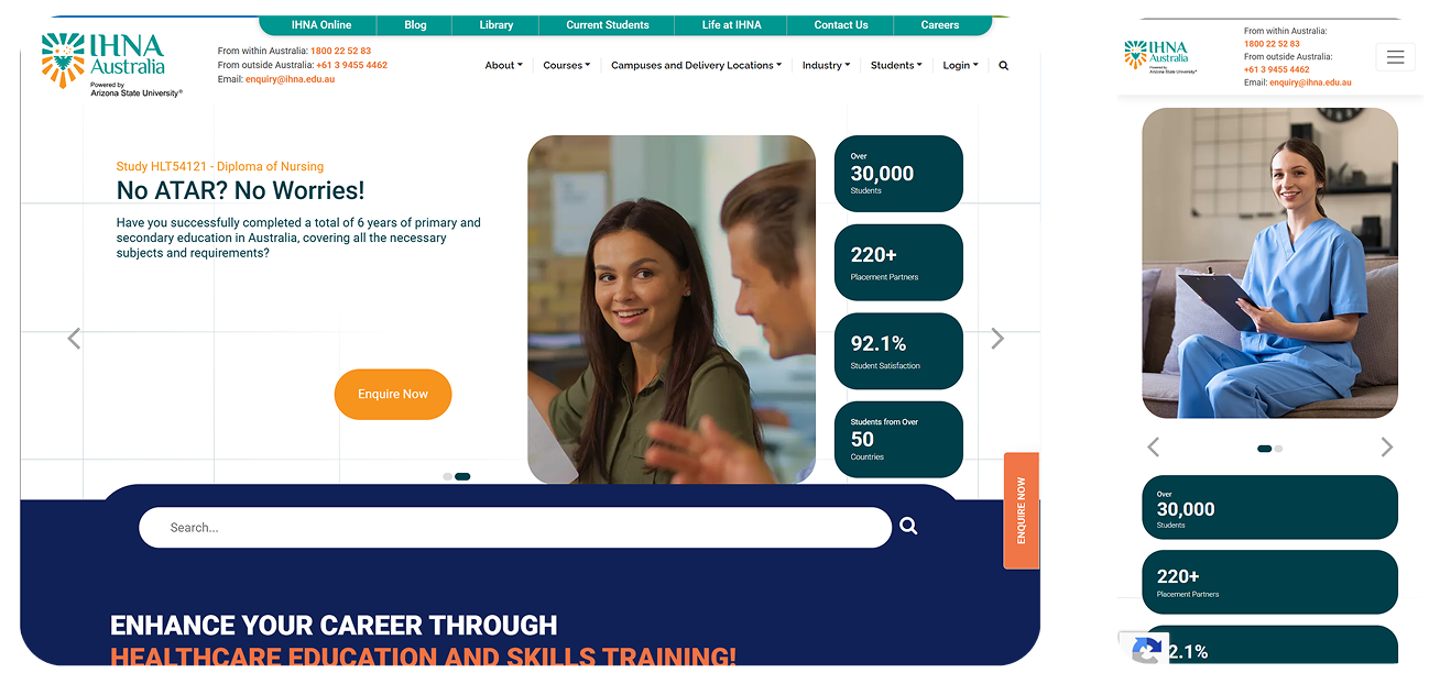
The website's deficient information architecture and cluttered navigation bury essential content, creating significant user confusion and inefficiency. This poor experience is compounded by a pervasive lack of visual consistency and a critical failure in mobile responsiveness, severely limiting the platform's ability to effectively deliver educational information.
Solutions and implementation
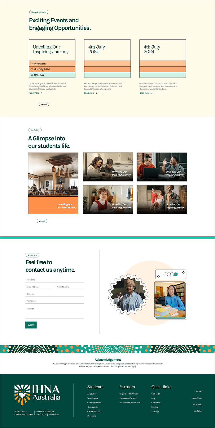
To address the documented usability and consistency issues, the solution focused on three main areas: structural clarity, visual cohesion, and technical responsiveness. We completely restructured the site's Information Architecture by categorizing the navigation and introducing relevant icons to visually differentiate content sections, significantly reducing clutter and cognitive load. To ensure users could quickly locate specific resources, we made the search bar more prominent and enhanced its functionality with real-time search suggestions. Furthermore, we tackled the visual inconsistency by introducing a new design style and a standardized set of elements (including typography and color palettes) applied universally across all pages, establishing a unified and professional brand experience. Finally, the entire design was built with a mobile-first approach to ensure full responsiveness, guaranteeing a seamless and optimized experience for users accessing the platform on any screen size.
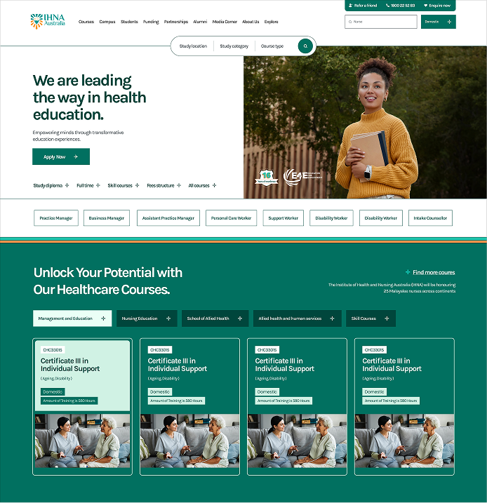
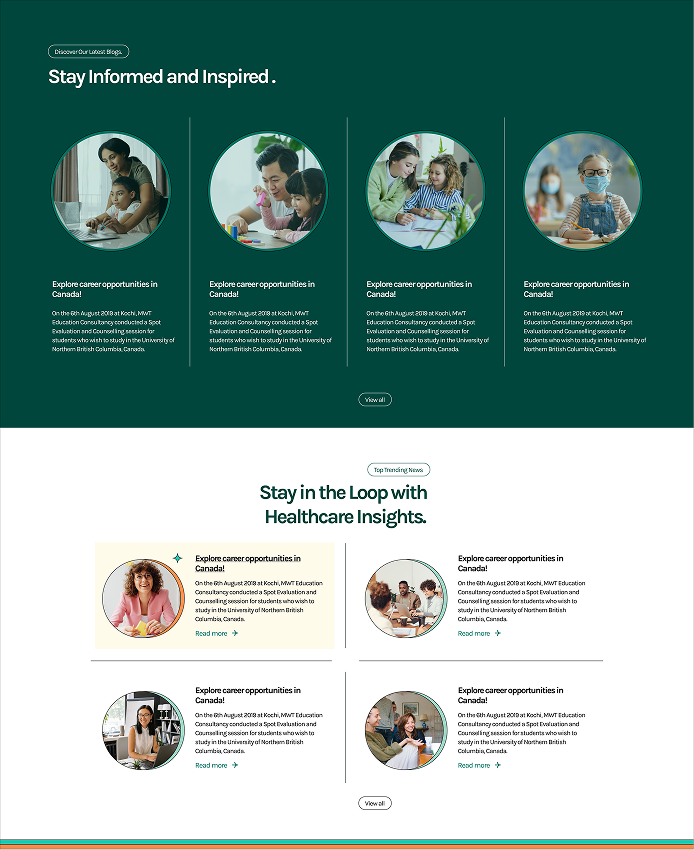
The redesign moved the website from being a source of user frustration to a reliable tool for user efficiency. The new design not only aligns the digital experience with modern standards but also positions the platform for future growth and strengthens its ability to effectively deliver its educational mission across all devices. The result is a unified, accessible, and high-performing website that better serves its learners.
