Future-Ready Skills, Anywhere Access.
Digital Regenesys Revamp
Case study
Goal
Digital Regenesys needed a platform experience that reflected its mission of delivering accessible, modern digital education to a global audience. The goal was to transform the site into an intuitive, learner-centric environment where users could easily understand programs, explore courses, and engage with flexible learning pathways. The focus was on reducing friction, strengthening clarity, and positioning Digital Regenesys as a credible, future-ready online learning ecosystem.
UX & Navigation Gaps in the Old Site
The previous experience lacked a clear structure, often overwhelming users with scattered information and inconsistent visual patterns. Course details, learning formats, and certification pathways were not presented in an intuitive hierarchy, leading to confusion for first-time visitors. Inconsistent interface elements, dense text blocks, and weak visual scanning cues made it difficult for prospective learners to quickly evaluate the right course for their goals. The mobile experience also suffered from layout compression and navigation overload, creating barriers for global users accessing the site on smaller screens.
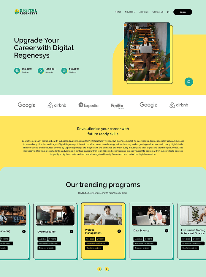
Solutions and implementation
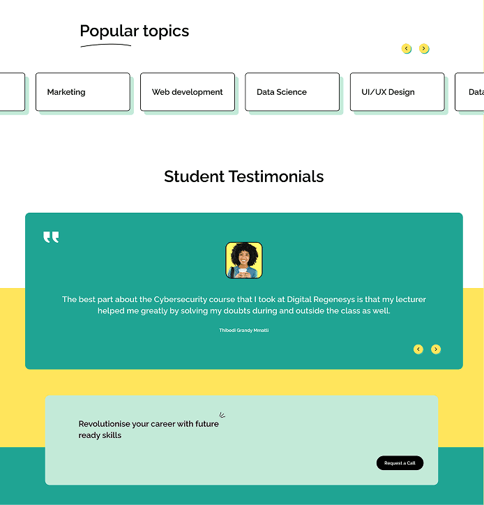
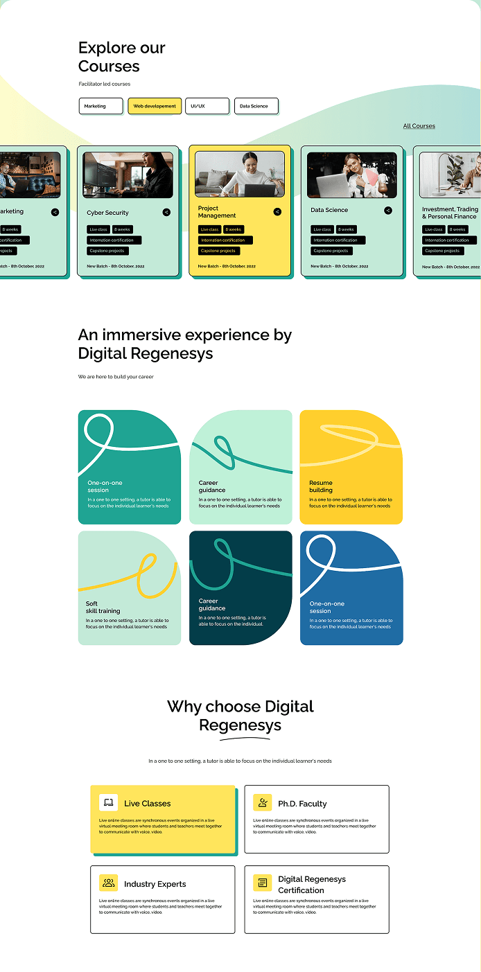
To resolve these UX gaps, we reorganized the platform with a structured, modular information architecture that guides users through clear decision pathways. We introduced consistent visual components, including course cards, category blocks, iconography, and simplified content modules to reduce cognitive load and improve scan-ability. The learning format, accreditation, and career outcome details were repositioned with visual priority to help users make faster, more confident decisions. A mobile-first layout system was applied to ensure that browsing, filtering, and course exploration remained seamless across devices. Simplified navigation, improved section grouping, and a focused content hierarchy created a more intuitive and trustworthy user journey.
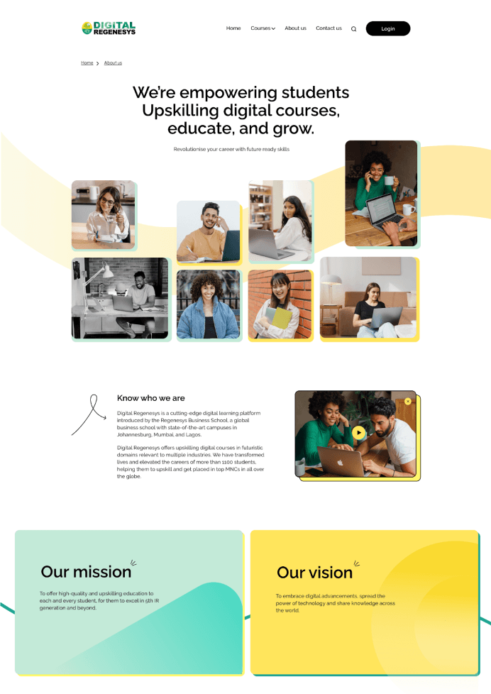
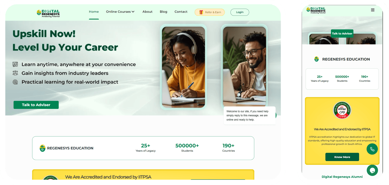
The redesign elevated Digital Regenesys from a content-heavy website to a streamlined, user-friendly learning platform. Users now experience clearer navigation, faster understanding of course value, and a consistent visual identity that reinforces trust. The mobile experience is significantly more responsive and accessible, supporting a global audience with diverse devices. The result is a cohesive, high-performing UX that aligns the digital presence of Digital Regenesys with modern learning expectations and enhances user confidence throughout the exploration journey.