Smart Learning, Seamless Experience.
APEX Australia (VET) Platform Revamp
Case study
Goal
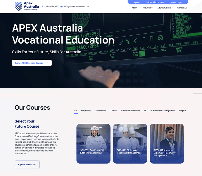
APEX Australia’s VET learning platform required more than a visual refresh — it needed a functional transformation. Our goal was to evolve the site into a modern, intuitive digital environment that supports vocational learners, trainers, and partners. We aimed to simplify the user journey, unify the design language, and create a platform that reflects APEX’s commitment to accessible, future-focused education.
UX & Navigation Gaps in the Old Site
The previous platform’s outdated structure and inconsistent navigation made it difficult for users to locate essential course information, enrollment details, and learning resources. Visual inconsistencies and an unpolished interface weakened the brand’s credibility, while the lack of mobile responsiveness created barriers for users who rely heavily on phones and tablets. Overall, the experience was fragmented and inefficient.
Solutions and implementation
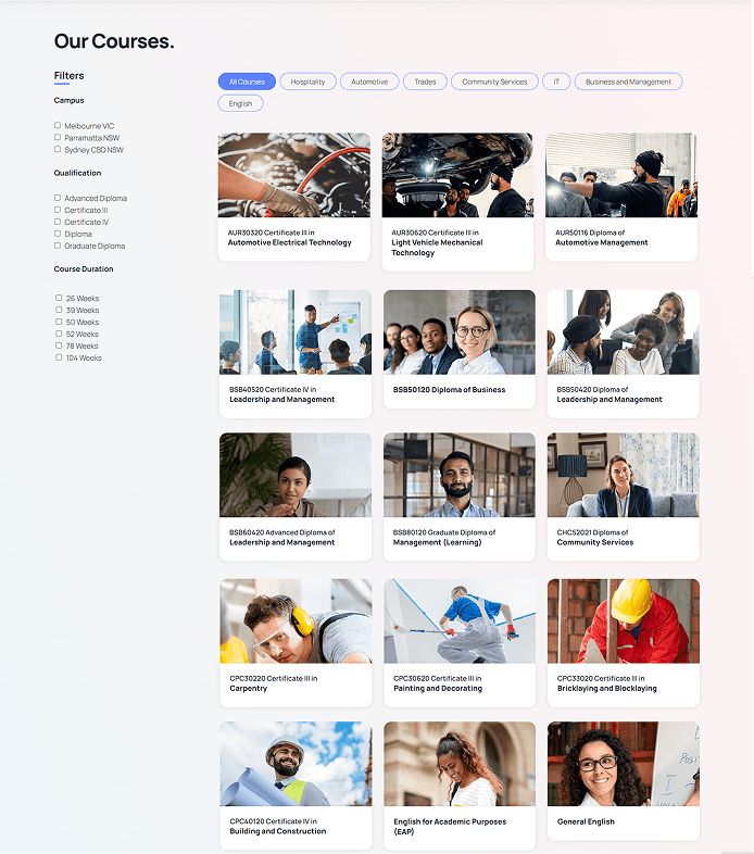
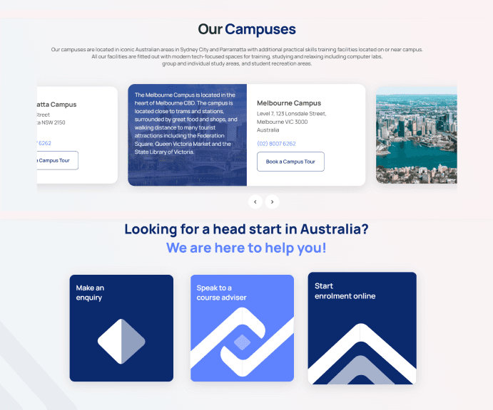
To address these challenges, we redesigned the platform around clarity, cohesion, and usability. The information architecture was reorganized to group content logically, reducing clutter and cognitive load. A standardized design system was introduced to ensure visual harmony across pages, supported by improved search functionality for faster content discovery. The entire build followed a mobile-first approach, optimizing layouts and interactions for all screen sizes and improving accessibility for every user.
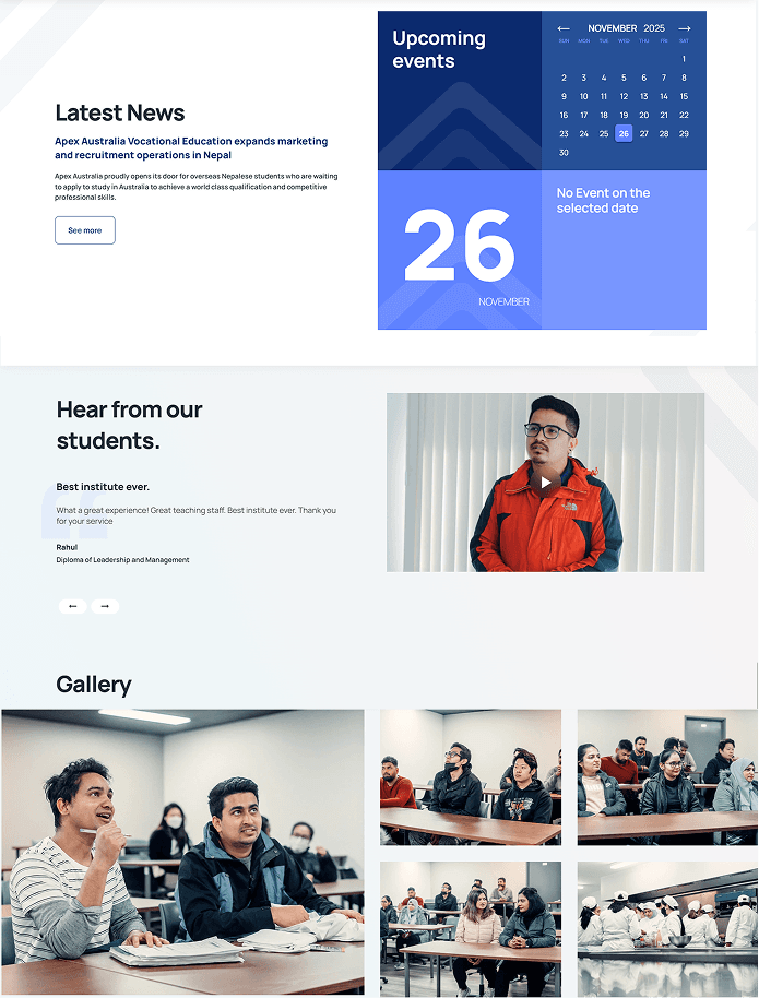
The redesign moved the website from being a source of user frustration to a reliable tool for user efficiency. The new design not only aligns the digital experience with modern standards but also positions the platform for future growth and strengthens its ability to effectively deliver its educational mission across all devices. The result is a unified, accessible, and high-performing website that better serves its learners.